


In Discussion: Margaret's
Notes on building a restaurant's visual identity

Earlier this month we introduced Margaret’s, a new modern British bistro in Cambridge, and the younger, more casual sibling to Michelin-starred Restaurant 22.
Margaret’s is now open and we suggest you visit soon. In this week’s issue of In Service we’re taking a closer look at the restaurant’s branding, created by GB&C and to tell you more about how it came to life.

This project began by getting to know Restaurant 22’s co-founders, Alex Olivier and Sam Carter, and learning more about the inspiration behind their new restaurant – the name of which is a tribute to close friend and regular guest of Restaurant 22, Margaret. Her story and their relationship became the foundation for the visual identity we went on to create. The brief here, was to produce a brand design and creative direction that felt both approachable yet distinct and could be used across all their channels of communication.
CREATIVE DIRECTION
We began by researching existing restaurants whose visuals resonated with Alex and Sam’s vision and used them as reference points to guide our approach.
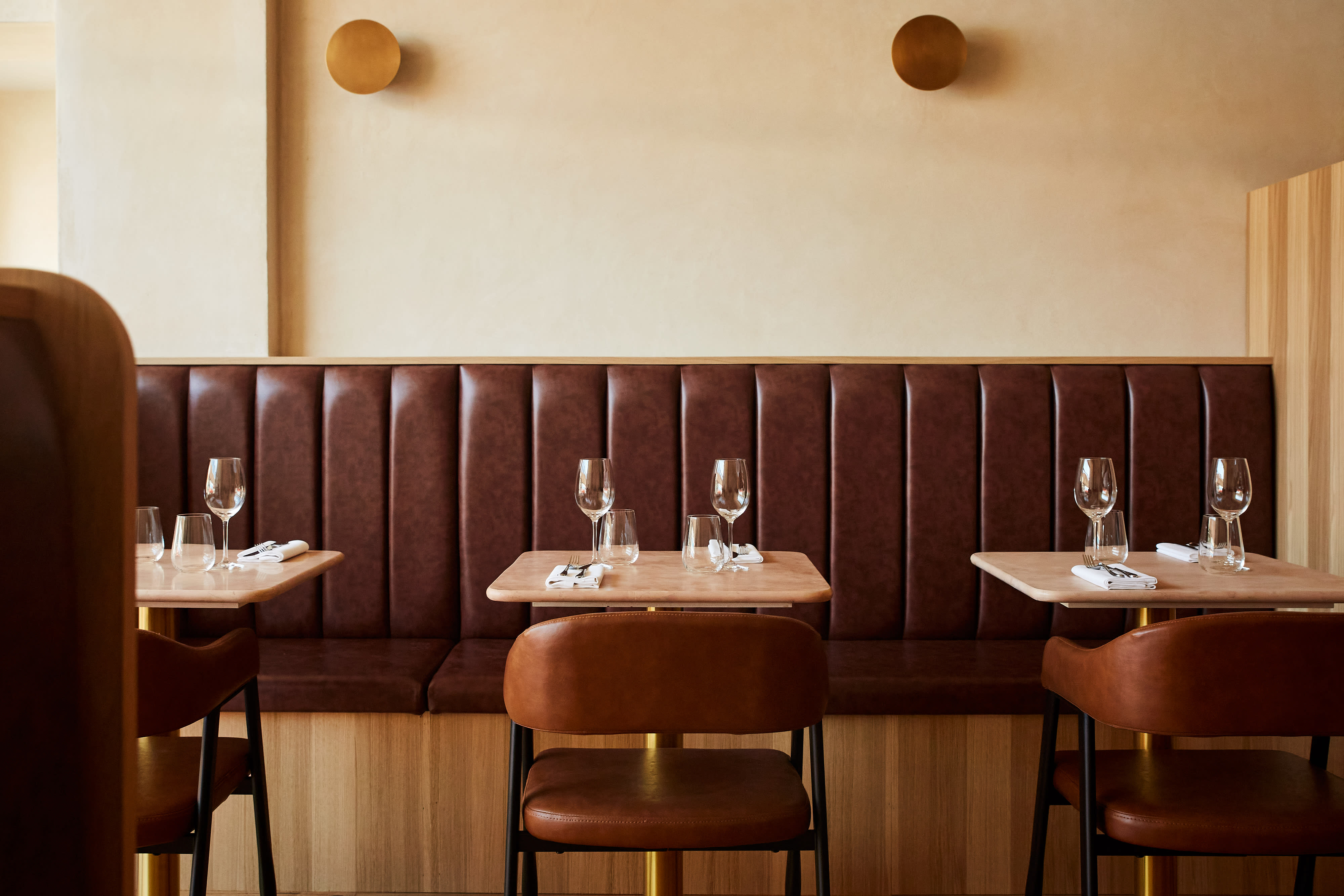
While trialling various colour schemes, we worked closely with Alex to help define and shape the interiors of the space, from banquet seating and fabrics, to paint swatches and bathroom tiles. For the final palette, we opted for a combination of pale yellow, burgundy, dusky pink, and a pop of tangerine – colours that now carry through into the restaurant’s interiors and reflect the energy of the restaurant.

Through conversations with Sam and Alex, we quickly understood the importance they placed on seasonality and locally sourced ingredients. This insight shaped the development of the restaurant’s key messages and their core values are reflected in the tone of voice we built for use across social media and website copy.
To communicate these messages consistently, we developed a set of brand guidelines, including content pillars, for the Margaret’s team to use and implement across all their social channels.


Matt Hague was the perfect photographer for this project. His imagery is both inviting and warm, bringing the creative direction to life.
BRAND DESIGN
We had established that the Maraget’s logo should feel neat but generous, and we chose a handwritten font that we refined and added texture to, creating a more dynamic styling. We opted for three variations of logo: the Margaret’s logo in full, a singular M for icon artwork, and an illustration of the restaurant’s exterior.

In a nod to Restaurant 22’s logo, we created a more contemporary, looser version of the building sketch. The unrefined edges and paint strokes bring the Margaret’s facade to life, while including the finer details of the exterior like plant pots and light fixtures, replicating it as closely as possible.

Once the design was finalised, we built a brand pack for the Margaret’s team to use, including the brand typography, logo and colour palette – a useful tool for businesses to have at hand for reference. The brand pack included mock ups of a sample menu and merch including business cards, posters, t-shirts and matchboxes, which helped Alex and Sam visualise the branding beyond their online channels.

Following completion of the branding, we set the website live and built a carousel of Matt Hague’s imagery - which will be updated seasonally to reflect new dishes - integrated SevenRooms for reservations, and refined copy across all pages, ensuring the minimalist design was maintained.
Margaret’s is now open, so book yourself in for lunch or dinner.

Leading this project was Sofie, Senior Marketing Manager, alongside Pani, Head of Projects and Callum, Designer. It was an absolute joy to work with Alex and Sam, and it has been very gratifying to see this design put to great use.
If you’d like to hear more about Margaret’s, or want to chat about branding and website projects, we’d love to hear from you.
GB&C